A company asked me recently to send them my updated resume.
I enjoy data visualization. Also, I am now trying to simplify my life towards essentials.
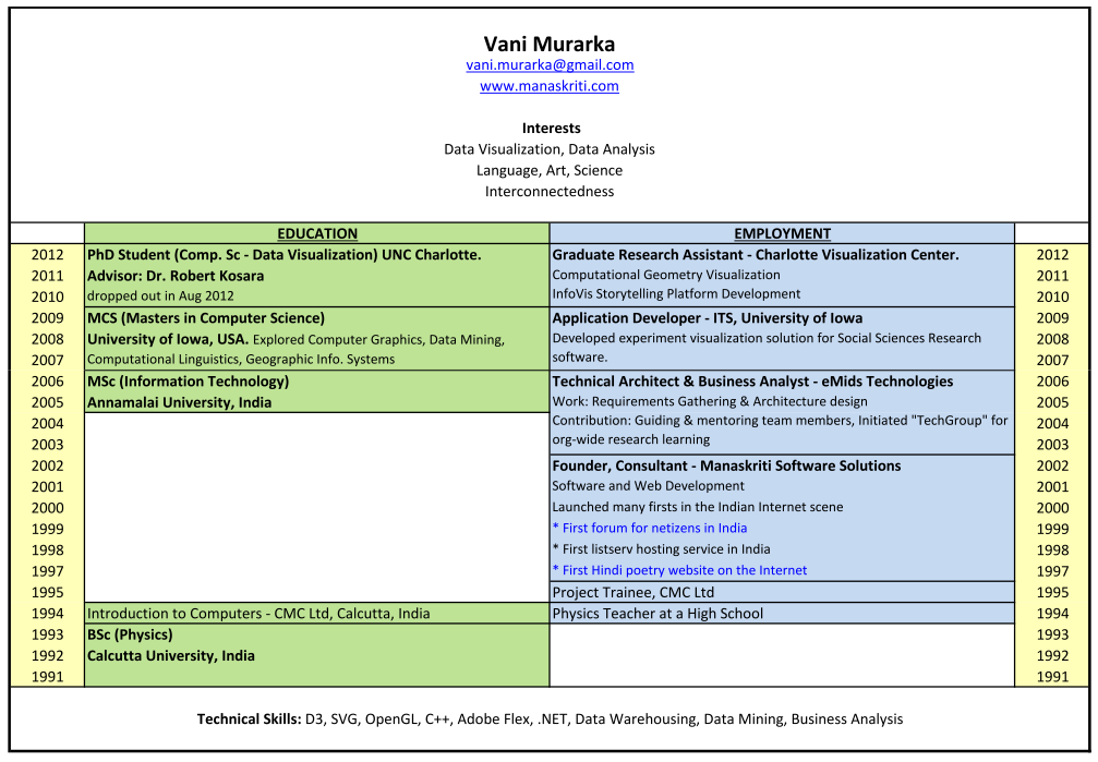
So this is what I came up with –

Click on the image for the full hyper-linked PDF version.
I like it for the following reasons:
Now, a bit more regarding the visualization.
Various forms of resume visualizations are there on the internet today. Below are some thumbnails. Click on them for the full view of these and other examples.
In comparison to whichever resume visualization that I have seen on the internet so far, and independent of them too – these are the specific reasons why I like the one that I cooked up:
- Bereft of excessive visual stimuli, it follows the KISS principle. Thus the objective of a more effective communication does not lose out against the agenda to impress. Infact it is so simple that it may hardly seem like a data visualization, but it is. The layout in fact is essentially the same as the left side of the first thumbnail [if you click it and see its full view]. However, it seems to me that, being visually simpler and more in line with conventional writing of text, makes this layout easier to assimilate.
- The spatial and color coded arrangement of information has the following impact
- gaps in education or employment are highlighted
- relative time spent at each engagement is more clearly apparent.
- provides space to write about each engagement in keeping with the amount of time spent at that engagement. Thus it encourages one to keep things brief.
- enables one to see simultaneous engagements. Normally these are listed separately in resumes.
- Gaps in history and relative time spent in engagements are derived information from resumes that HR specially looks out for. I suppose people in HR become adept at mentally identifying these when they glance through resumes. Such a layout would facilitate things for them.
- The information that the visualization highlights would be largely apparent even in smaller thumbnail-type versions. Two examples are given below.
- Lastly, it is made using MS Excel. So anyone can make a similar one using any spreadsheet software. No special visualization tool is required.
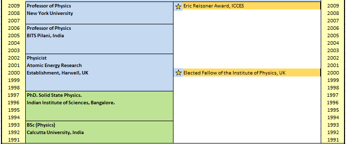
The layout can be tailored to specific individual trajectories and on the choices made of what one wants to highlight. Here are some possibilities:
- Many people first finish their official education which is followed only by work life. In such a case, a long empty left column may be a waste of space. One can either then keep the learning and working entries in the same column, with different color coding, or use the learning [education] column to mention other professional trainings, certifications, workshops during one’s work life, that the individual may want to highlight.
- Two ways come to mind for including awards and recognitions.
- By including an icon [like a star] and relevant text, in the box of the relevant engagement. In this case however, there may not be enough space for mentioning the award/recognition completely, or against the correct year.

- If learning and working are merged into one column, with different color coding, then space is available for a separate awards and recognition column.

- By including an icon [like a star] and relevant text, in the box of the relevant engagement. In this case however, there may not be enough space for mentioning the award/recognition completely, or against the correct year.
I offer this layout to you dear reader, in case you want to use in your own resume or in your organization.


