In my last post, I shared with you this painting of mine and said that it took shape by itself as I let my hand move any which ways it felt like.
Its a rather unusual shape for a tree, isn’t it? As it took shape, I realized it was a sub-conscious inspiration from Florence Nightingale.
How so?
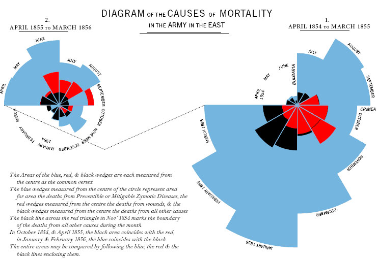
Florence Nightingale was one of the pioneers of Data Visualization – of presenting statistics as images to make a point emphatically. She collected meticulous data on the cause of soldiers’ death during the Crimean War and created this visualization below. This was way back in 1854! Blue indicates death due to preventable causes, mainly lack of hygiene. Red indicates death due to wounds in war. Black indicates other causes such as accidents.

This image taken from GuideStar International’s Blog.
Thus via this data visualization she clearly showed that the majority of the deaths that were occurring seemingly due to war were actually totally preventable by practice of better hygiene. This made a persuasive impact on the British government of that time. It laid the foundation of incorporating hygiene as an intrinsic policy in hospitals. Here is a lovely short video on this topic, which tells us more about this somewhat less known aspect of Florence Nightingale.
The painting above was made during the days when I was a student of Data Visualization at the university. Regarded as a classic and pioneering example of the efficacy of data visualization, this image of Florence Nightingale’s work came up often in stuff that I read and talks that I attended. Not surprising that it meandered into a painting one day.
So what is the point of this post? It is this.
The way art takes shape when I just let it flow – at times it feels divine. The myriad ways in which what I see and encounter in life has an impact on me is fascinating. The impact is many a times not in a manner and direction that one would conventionally expect. That itself makes life so much more richer.
~ vani murarka

1 comment